Background
While in Paris – the city of love and lovers – Jamie falls victim to the charms of the French ladies. One lady in particular, Madame Annalise de Marillac, is very responsive to his amorous attempts, even though she has another suitor.
Jamie finds out that Charles Galousie is his opponent for Annalise’s attention. The two men start to quarrel and Jamie challenges Charles to a duel. When Jamie manages to place a serious wound on Charles, Annalise makes her choice and turns to the wounded man to comfort him. Jamie leaves the meadow as the winner of the duel but the loser over a lover.

Photo by Ricardo Cruz on Unsplash
Designer's Thoughts
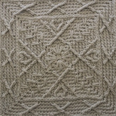
Imagining a duel, I immediately thought of the expression “crossing swords” – well, it is the literal translation of a German metaphor in any way.
So the design was clearly requiring that kind of element.
Because the duel – like most in these days in Paris – was initiated by a matter of the heart, I could not resist to include a little heart as a symbol of love.
I love the use of the spike stitch as an allegory for the spikey, snappy, quick and pointy movements when the fencers attack and retreat.
Iman van der Kraan, designer of Haaksteek and temporary editing and testing support, made her Spike stitches betweeen the horizontal bars of the single crochet instead of underneath it. Admittedly they look much neater than plain Spike stitches, which is why consequently the design has been altered to use split Spike stitches.
Grey as the obvious colour choice for the Storyteller colourway is of course inspired by the steel of which the swords or rather rapiers are made.
‘Around-the-corner design thought’:
“en-garde – pret – allez” are the three words the referee utters before the start of the bout (attack in sport fencing). “Je suis pret” means “I am ready” and is engraved in Jamie’s clan brooch as his motto.
The free pattern page with photo and video tutorials can be found here:
Share this with your friends in your favourite network
The Background of Square 1 – Year Of The Ox
The Background of Square 2 – Sawny
The Background of Square 3 – Goodbye, Mama
The Background of Square 4 – Guarding His Right
The Background of Square 5 – Manners and Chess
The Background of Square 6 – L’Université
The Background of Square 7 – The Duel – this post
The Background of Square 8 – Scars
The Background of Square 9 – Rebekah
The Background of Square 10 – Hunting
The Background of Square 11 – Next of Kin
The Background of Square 12 – Sassenachs